With a new season means the arrival of new color trends! Thanks to the Pantone Color Institute, we can look forward to color changes to help keep up on top of the latest and greatest trends – and even give us some inspiration when it comes to decorating and color classes!
This fall, Pantone released a set of colors that are expected to be popular in all things fashion and home decor to coincide with New York Fashion Week.
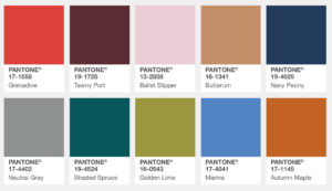
“Bookended by a dynamic Grenadine red and a tawny Autumn Maple, the color palette for Fall 2017 leans more to warmth, “ says Leatrice Eiseman, Executive Director of the Pantone Color Institute. “While comforting, enveloping colors and ease are crucial to the seasonal feeling, standout shades include a pale pink Ballet Slipper, a refreshing Golden Lime, and a bright Marina blue. These hues add a striking touch when paired with the classic autumnal shades of Navy Peony, Neutral Gray, Butterum and Tawny Port.”
Honestly, we could see ourselves using any of these colors in our home designs this fall. Even that bright pink that might make you think of spring or summer rather than fall, but all things pink (including Millennial Pink) are taking over the color scene this year!
We’re so excited to pair colors like Tawny Port with Shaded Spruce or Navy Peony and Grenadine with Autumn Magic and Butterum!
What color combinations are you most excited to use from this fall’s palette? Let us know in the comments below! Learn more about our Color Confidence classes, decorating classes, and more offered at The-DSA by visiting www.the-dsa.com.


