Vibing with Color
Vibing on Color
Color, or colour for our Canadian readers, is the key building block of any beautiful room, the element of design that can make or break a space. It is probably the most personal part of the design process because preference is based on so many things…such as life influences, memories, and experiences. The architecture may be amazing but surrounded by colors in competing color palettes or in a saturation preference you or your client dislikes…the vibe is off.
To determine your vibe, the Question isn’t “what’s your favorite color” but “What version of a color is your favorite?” Hue name may specify a color family but not the intensity or saturation of a color. Each generation of color, like people, shares common elements, but still has a unique personality. From Bright down to the Neutralized generation, the change in saturation also creates a change in emotion. The name of a color doesn’t tell the story...as blue can mean a soft, peaceful blue or a bold, bright blue. Each color has different versions and each person is attracted to a different saturation.
Define and clarify the saturation level you prefer to narrow down your color palette. As you look at the paint samples pictured, notice how the intensity of a color changes. Each transition shows a new generation.
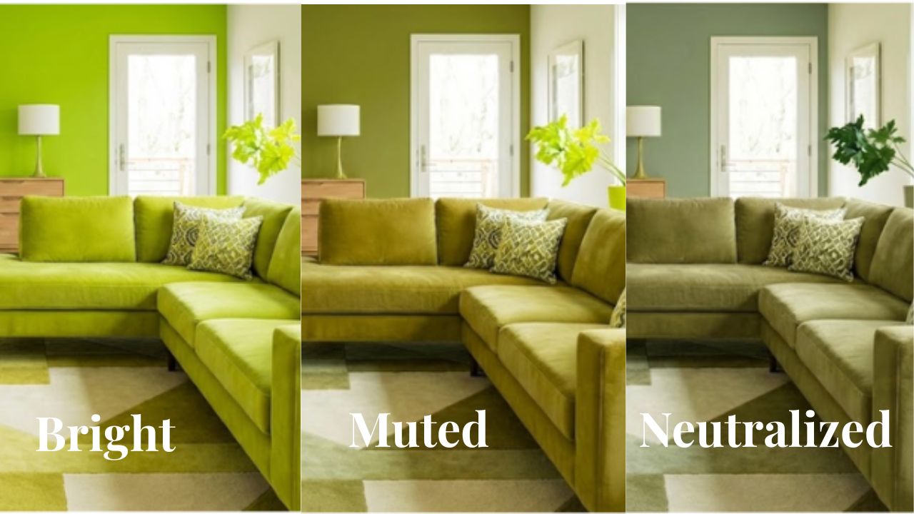
From Bright, to muted and then neutralized, each generation impacts the emotion of the room. The greens on the next page show the difference. The three versions of green show the impact of the change in saturation. The change not only impacts the aesthetics but also the “vibe” of the space. Are you a Bright, Muted, or Neutralized?
Be sure to join us on January 27 at 7 PM ET for a deeper dive into color in the Design Boardroom-Color Made Easy. Plus, we will focus on color, the entire month of February, from we will be talking about how to find the best white, color vibing, and more.
Stay tuned for more color info over the month.